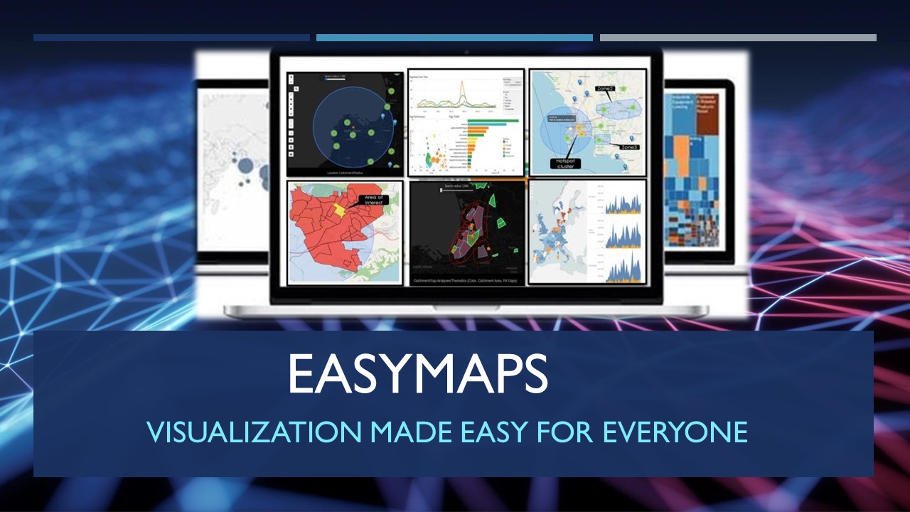

Here's Everything You Need to Know About Data Visualization to Make Data Easier for The Human Brain to Understand and Pull Insights from.
What is data visualization?
Visualization is the practice of translating information into a visual
context, such as a map or graph, to make data easier for the human brain to
understand and pull insights form. The main goal of data visualization is to
make it easier to identify patterns, trends and outliers in large data
sets.
Visualization is the act or process of interpreting data into visual
terms such as pictures, graphs, or simulations. visualization allows
clearer communication of an abstract or complex concept.
Who uses data visualization?
Data visualization is important for almost every career. It can be
used by teachers to display student test results, by computer scientists
exploring advancements in artificial intelligence (AI) or by executives looking
to share information with stakeholders. It also plays an important role in big
data projects.
Politics. A common use of data visualization in politics is a
geographic map that displays the party each district voted for.
Healthcare. Healthcare professionals frequently use choropleth
maps to visualize important health data. A choropleth map displays divided geographical
areas or regions that are assigned a certain color in relation to a numeric
variable. Choropleth maps allow professionals to see how a variable, such as
the mortality rate of heart disease, changes across specific territories.
Scientists. Scientific visualization allows scientists and
researchers to gain greater insight from their experimental data than ever
before.
Finance. Finance professionals track the performance of
their investment decisions when choosing to buy or sell an asset. Candlestick
charts are used as trading tools and help finance professionals analyze price
movements over time, displaying important information, such as securities,
derivatives, currencies, stocks, bonds and commodities. By analyzing how the
price has changed over time, data analysts and finance professionals can detect
trends.
Logistics. Shipping companies can use visualization tools to
determine the best global shipping routes.
Data scientists and researchers. Visualizations built by data
scientists are typically for the scientist's own use, or for presenting the
information to a select audience.
Why should I use data visualization?
Visualization lets you comprehend vast amounts of data at a glance
and in a better way. It helps to understand the data better to
measure its impact on the business and communicates the insight visually to
internal and external audiences. Decisions can't be made in a vacuum.
· It helps Analyse Data
in a Better Way. Analyzing reports helps business stakeholders focus on the
areas that require attention. ...
· Faster Decision Making.
Humans process visuals better than any tedious tabular forms or reports. ...
· It Makes Sense of
Complicated Data.
When is the right time to use data visualization?
The importance of visualization is to helps people see, interact with,
and better understand data. Whether simple or complex, the right visualization
can bring everyone on the same page, regardless of their level of expertise.
Other benefits:
- Faster and more accurate
- Better collaboration
with other departments for effective strategies
- Effective workforce
planning with data from across the enterprise
- Proactive decision-making
during uncertain business environments with a comprehensive view of
all business data across the enterprise
- Gain leadership
buy-in with easy-to-understand dashboards and visualizations.
Where can data visualization be used?
In marketing analytics, data visualisation is a boon. We may use
visuals and reports to analyse various patterns and trends analysis, such as
sales analysis, market research analysis, customer analysis, defect analysis,
cost analysis, and forecasting. These studies serve as a foundation for
marketing and sales.
· Media
ROI-Improve ROI, reduce ad waste and increase footfall.
Analysis-Perform competitive analysis.
Audience-Strategies ad placement and target the right
audience.
· Telecommunication
Coverage-Assess coverage and plan expansion in specific
areas.
Competitive Edge-Gain a competitive edge over other networks and
services
Proximity-Expand customer base by providing stores in ideal
proximity.
· Retail
Competition-Identify competition in a particular neighborhood.
Analysis-Site and footfall analysis for new stores and point
of sales.
Expansion-Plan expansion in a new city or country
· Public sector
Facilities-Improve public services based on the availability
of facilities.
Infrastructure-Optimize and monitor traffic, healthcare, and
public infrastructure.
Plans-Create crime/disaster response plans by mapping SOS
services.
· Insurance
Risk-Map buildings and structures in disaster-prone
zones
Control-Insurance companies can widen their customer base,
control and minimize risks, accelerate claim procedures, and improve fraud
detection with location intelligence data.
Crime & Theft-More in-depth LI data like
region-specific crime rates related to car theft, severe weather conditions of
the city or state will provide additional information to the insurer.
· Property
POI-Map dining, schools, hospital, and facilities
around new projects
Valuation-Neighborhood assessment for competition &
valuation research
Location-Enrich online selling and renting platforms with
location precision.
· Healthcare
Industries
A dashboard that visualizes a patient's history might aid a current or
new doctor in comprehending a patient's health. It might give faster care
facilities based on illness in the event of an emergency. Instead of sifting
through hundreds of pages of information, data visualization may assist in
finding trends.
· Finance Industries
For exploring/explaining data of linked customers, understanding
consumer behavior, having a clear flow of information, the efficiency of
decision making, and so on, data visualization tools are becoming a requirement
for financial sectors.
· Marketing
We may use visuals and reports to analyze various patterns and trends
analysis, such as sales analysis, market research analysis, customer analysis,
defect analysis, cost analysis, and forecasting. These studies serve as a
foundation for marketing and sales.
· Education
Users may visually engage with data, answer questions quickly, make more
accurate, data-informed decisions, and share their results with others using
intuitive, interactive dashboards.
· Data science
Data scientists generally create visualizations for their personal use
or to communicate information to a small group of people. Visualization
libraries for the specified programming languages and tools are used to create
the visual representations.
How will data visualization benefit you?
Visualization allows business users to recognize relationships and
patterns between the data, and also gives it greater meaning. By exploring
these patterns, users can focus on specific areas that need attention in the
data, to determine the importance of these areas to move their business
forward.
· It enables
continuous improvement of data science
Data visualization allows the entire business team to contribute to the
evolution of data science within a company by facilitating pattern
identification and effective communication.
· It can be easily
modified for different audiences
Visualization allows us to look at raw data from various perspectives.
the same data can be represented visually in various formats to suit the needs
or priorities of different audiences.
· It enables swift
decision-making
One of the best benefits of data visualization is that it provides users
with a swift, effective, and easily accessible way to identify important
patterns.
· It makes identifying
relationships easier
Visualization assists with relationship identification. Oftentimes, data
sets contain many complex relationships, and identifying which of these are
relevant may require a broader understanding of the area being studied.
By the way, did you know that you can Paint Masterpiece Visualization
Like A BI Expert Without Ever Using SQL, Scripting or Programming with EasyMaps
BI? Yep, it's true.
Go to our website, click on Claim Special now 100% Risk Free
Guaranteed, you will then be presented with a form, fill in the form and
click the Submit button for your free 30 days 100% Risk Free Guaranteed trial
account to be activated.
Thanks
#asymaps #geospatial #spatialAnalysis #locationIntelligence #gis #mapping #businessIntelligence #analytics #visualization